
Back
MOVIE CIRCUIT IDENTITY
2022
This was problably one of my favourite project works.
It was proposed to develop a whole movie circuit for a collection of various Spielberg movies, so we should create a whole identity and aesthetic for the circuit that would be composed by:
1. Poster
2. Profile Picture for Social Media
3. Facebook Banner
4. Instagram Publication
5. Instagram Story
6. Street Poster for Bigger scales
7. Digital Poster
8. Street Banner
9. T-shirt
10. Movie Circuit Magazine
For the magazine every textual content was already gived by the teacher, the aim of this graphic material was to work the editorial part and devolping it in a coerent way that matches our concept.
My work
I took the time to watch a documentary about Steven Spielberg career and how his personal life, including his childhood and teenager times, influenced him in the creation of his films. I already knew and watched a lot of his movies so I knew a little bit about what he was saying in the documentary, but watching this doc was a really big help to define my work.
My project, poster, magazine, everything, was created by defining the big
key word: Separation
Why this word?
Spielberg always has in his films some kind of distance, the son who separates from his parents because of a war, a divorce, a disappearance, a catastrophe, a physical or psychological separation, whatever Spielberg's movie we talk we will easily find the concept of separation, especially related to the idea of family. Remembering that Spielberg tells us that he had his parents divorced when he was very young, so it's evident that his films have references to his personal life and what he experienced.
After having the concept defined the aesthetic of my whole project came more naturally.
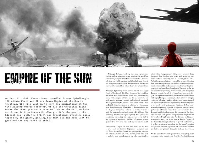
Spielberg has also a lot of films that the action takes place in some decades ago, like 40's or 50's, like "Schindler's List" that is also a movie included in the movie circuit for this project. So for this reason, black and white with only one other color, being a dark red, were the colors used in my whole work, giving a more dramatic ambience.
I used a typeface for the text which refers to the typeface that old typewriters produced, thus making a connection with, just mentioned, "Schindler's List". For titles, I used "Punishment", a crude and massive letter, with several breaks and the idea of stencil, referring to the typography used in combat/war materials, which is related to the concept of separation that so defines this work.
Below there is all the material produced.
Project done in April 2022
Poster


Profile Picture


Facebook Banner

Instagram Publication

Instagram Story

Instagram Publication
T-shirt
Street Banner


Movie Circuit Magazine


Explanation Dossier


© Nuno Pinto